Context
Safe meeting is a product/service that was built in order to bring more safety to the offline stage of negotiation in the process of vehicle purchasing. It’s a compilation of tools that will ease the online process and mitigate risks in the physical meetup between sellers and potential buyers.
I collaborated with three other designers for four months during the Research and Experience phase and then worked independently for an additional two months to focus on designing the user interface.
The problem
After conducting the Q3.20 annual qualitative research, which aimed to identify challenges and opportunities within the OLX autos journey, the research team found that all 21 users interviewed (10 buyers and 11 sellers) expressed concerns about their safety during physical visits to view and show vehicles, and requested assistance in reducing the associated risks.
It became clear that something needed to be done.
Challenge
How might we mitigate risks in the physical meetup stage while offering tools for users to feel safe within and off the platform in a simple and practical way?
Process
I collaborated with three other designers during the discovery phase. In Q3.2020, the research team conducted the annual qualitative research, uncovering user motivations, pain points, and behaviors.
The first draft was launched using a Hotjar link across multiple vehicle adviews on the platform, which redirected users to an unmoderated usability test at Maze.
From 875 responses, we created clear, achievable goals:
- Goal - Develop an internal product that enhances practicality in the online process and improves safety during offline negotiations (physical encounters).
- Target audience - Buyers and sellers.
-
Desired outcomes - Reduce scamming, fraud, and dishonesty while enhancing platform credibility and perception of safety.
Timeline
Principles
Set of 5 principles used to structure the project.
Local - It’s about meeting people at safer places close to you
Mobile - It’s location-based and optimized for use on the go
Safe - Public locations with safety features for the meetup (surveillance, etc)
Active - Focus on getting people engaged in a more safe and effective negotiation
Simple - Ease the online process (scheduling place, date, time and chat features)
Opportunities
Based on the insights collected during the autos annual qualitative research, desk research and report analyzes, 3 core opportunities emerged.
01. Assistance in choosing the best place to meet
02. Mitigating risks in the offline stage
03. Online stages and communication
Assistance in choosing the best place to meet
What was happening
Users have their own habits of searching and choosing locations to meet, but the timing wasn’t always right, as often one part or the other was only available on this day or that location, which ended up making their security criteria irrelevant, as they were not put into practice.
"This worries me (theft, etc) if I need to show or receive someone I have to have security (personal) and local too, it can even be in my condo, in the garage. I am not afraid to receive in my condo, because is very safe."
The first glance
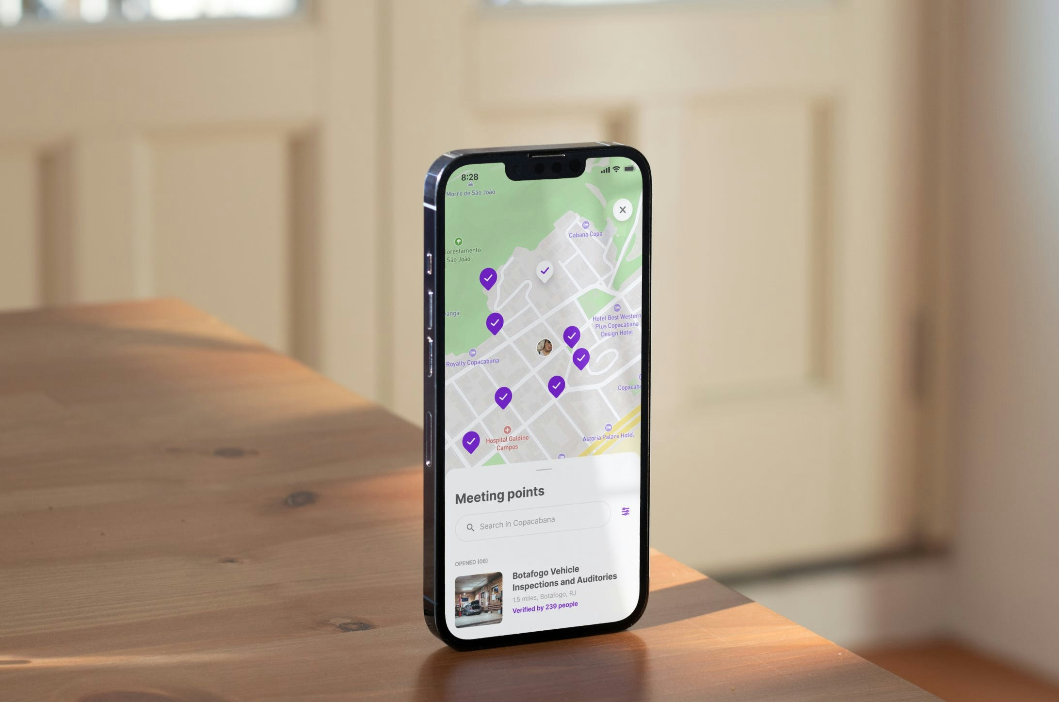
Using an interactive map with colorful pins, we ensured the user would focus on finding the safest meeting points for encounters according to their filter specifications.
Each location provides essential information, such as address, distance, and verified experience from other users, enhancing the overall perception of safety.

Personalization
The filter page allows users to choose from four types of places, set a maximum distance range, and see top-rated meetup places according to user feedback.
Mitigating risks in the offline stage
The scenario
While users know the risks associated with physical meetups, they often rely on their safety measures, such as bringing along someone they trust or scheduling meetings in familiar and public spaces. However, despite the awareness, many individuals overlook evaluating the entire situation, which can be dangerous.
“Once I had a sale at my front door and you meet every kind of person that you don't feel comfortable. Now I book at the mall (where I work), which has a lot of security.”
“I went with my husband. Since he understood more, he went. He drove the car. The car didn't make any noise, the gears were ok. He opened the hood, looked at the engine and everything. it was fine. We were safe.”
Meeting point page
The location page addresses services that mitigate risks, enhancing the feeling of security and establishing a reliable connection between users and the product.
Strategic locations
The choice of locations was strategic, aiming to enhance our product's value by addressing users' lack of basic technical knowledge, which often led to difficulty in identifying potential issues and making informed purchases.
“When I decide to go and buy the car, I will take a mechanic with me for him to do a check-up. My biggest fear is about the veracity of vehicle information."
Online stages & communication
Facilitation
The safest and most essential step is facilitating communication between buyers and sellers through the platform. We always encourage users to chat through the platform, which is less dangerous than other conversation spaces.
Ease the process
By allowing users to go through the process online, such as scheduling a date and time and establishing a conversation with the other party through chat, we ease the process and, consequently, the product's value.
Transparency
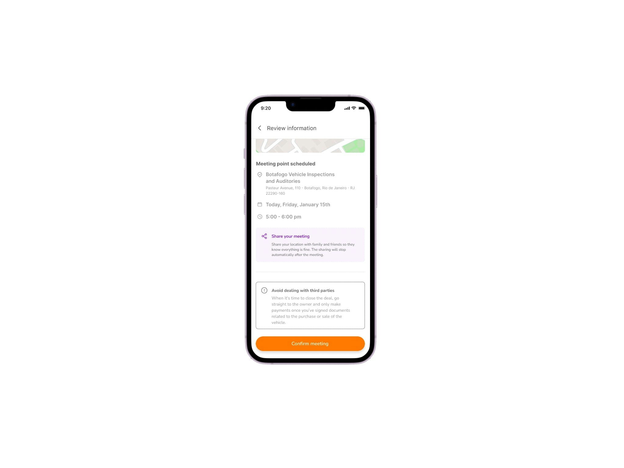
Transparency in communication throughout all stages was a crucial aspect of our approach. A dedicated review page was designed to provide buyers with details about the vehicle of interest and the precise meeting location.

Automated (but not too much)
A real-time feedback system provides relevant information to both parties involved in the meeting, helping to address sudden changes, such as unavailability of dates or times, allowing adjustments.
Safety first
Last but not least, sharing the location in real-time with family and friends brings a greater sense of security to those involved, allowing for a more effective negotiation to take place.

Overall results
The product is due to be released in 2023.2.
Report analysis from 1st unmoderated usability test (875 responses) showed:
- 85% - Report lack of platform support in risk mitigation (mobile + desktop)
- 90% - Product concept approval (mobile + desktop)